I Use TailwindCSS Except in These Three Scenarios

in Web Dev
Last updated:
TailwindCSS is awesome!
Tailwind utility classes are a great way to build applications quickly, reduce application load time, and increase locality of behavior in your codebase. This comes from someone who has spent much time writing CSS. In fact, this blog relies on no CSS frameworks and has a main.css that is over 1K lines long!
I've found that TailwindCSS is excellent for many use cases except three: pseudo-elements, focus/hover states, and transitions/animations.
When TailwindCSS was created, scoped CSS at the component level did not exist. However, with advances in front-end frameworks like React, Vue, and Svelte, you can now write CSS that is scoped with the component instead of maintaining a cascade for your entire application. I propose that scoped CSS is a superior solution to these three scenarios.
Pseudo Elements (::before, ::after)
Let's take the following component on the showcase page of my personal website (JohnSolly.dev).
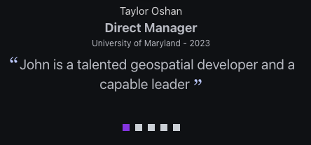
Pure Tailwind Utility Classes
Here's how it might look if we were Tailwind purists.
<p class="testimonial-quote max-w-[450px] break-words text-xl before:content-['\201C'] before:text-[#c3ceff] before:text-4xl before:font-serif before:relative before:top-[0.2em] before:left-[0.1em] after:content-['\201D'] after:text-[#c3ceff] after:text-4xl after:font-serif after:relative after:top-[0.3em]">
    {item.quote}
</p>
What a mess! Now, I can hear the Tailwind fan girls dunking on me and suggesting I use @apply to reduce the # of classes. Sure, I could do that, but then I'm putting styles in another file, which brings us back to how vanilla CSS works (styles in a separate file)
Tailwind + Scoped CSS
Instead, I use a hybrid approach of Tailwind classes and scoped CSS within the .astro component to place and style the double quotes around the text. Isn't it a lot easier to scan and understand?
<p class="testimonial-quote max-w-[450px] break-words text-xl">
     {item.quote}
</p>

<style>
    .testimonial-quote::before,
    .testimonial-quote::after {
        display: inline-block;
        line-height: 0;
        position: relative;
        color: #c3ceff;
        font-size: 2rem;
        font-family: Georgia, serif;
    }

    .testimonial-quote::before {
        content: "“";
        top: 0.2em;
        left: 0.1em;
    }

    .testimonial-quote::after {
        content: "”";
        top: 0.3em;
    }
</style>
Hover/Focus States
Another place I prefer to use something other than the Tailwind is with hover + focus states. You CAN do it in Tailwind, but your class list will explode.

Pure Tailwind Utility Classes
<div class="link-card text-lg rounded-lg flex opacity-80 border border-transparent transition-all duration-300 ease-in-out hover:border-purple-200 hover:opacity-100 focus-within:border-purple-200 focus-within:opacity-100">
<a
href={href}
target={isRelativeLink ? "_self" : "_blank"}
class="rounded-lg py-6 px-5 no-underline text-inherit bg-accent-dark-overlay-lvl-2"
rel={rel}
>
<h2 class="text-white text-2xl font-bold mb-4 flex justify-between group">
<span class="link-card-title group-hover:underline group-hover:text-underline-offset-2">{title}</span>
<span>→</span>
</h2>
<p>{snippet}</p>
</a>
</div>While some people are OK with reading 20 tailwind classes in a row, I find it overloaded. Sure, you could reduce the # of classes with an @apply, as mentioned earlier, but then you have to put that in another file, and you're back to how things are with vanilla CSS.
Tailwind + Scoped Vanilla CSS
In my hybrid approach, I use Tailwind for the styling, but the focus/active states are written in vanilla CSS within a scoped CSS block. When reading this code, it's clear that the border and opacity change when the element is hovered/focused.
<div class="link-card text-lg rounded-lg flex">
<a
href={href}
target={isRelativeLink ? "_self" : "_blank"}
class="rounded-lg py-6 px-5 no-underline text-inherit bg-accent-dark-overlay-lvl-2"
rel={rel}
>
<h2 class="text-white text-2xl font-bold mb-4 flex justify-between">
<span class="link-card-title">{title}</span>
<span>→</span>
</h2>
<p>{snippet}</p>
</a>
</div>
<style>
.link-card {
opacity: 0.8;
border: 1px solid transparent;
transition:
border-color 300ms ease-in-out,
opacity 300ms ease-in-out;
}
.link-card:is(:hover, :focus-within) {
border-color: rgb(232, 196, 249);
opacity: 1;
}
.link-card:is(:hover, :focus-within) .link-card-title {
text-decoration: underline;
text-underline-offset: 0.2em;
}
</style>With the transitions and focus/hover states moved into scoped CSS, I can clearly (and quickly!) see what is happening to the element when it is in focus or hovered. The border color changes, the opacity increases, and the link card title's underline is removed.
Transitions/Animations
Keyframes and anything related to moving things around on the screen are a nightmare in Tailwind. Here's an example from my showcase page for rotating a chevron symbol when the user clicks on an accordion to open my bio.

Pure Tailwind Utility Classes
This doesn't work precisely, but it's close to what you must do. The tricky part is that the way I have my HTML and JS written, the SVG animation happens when the parent button's `aria-expanded` is toggled on/off.
<button
  class="flex items-center w-full accordion-btn"
  aria-expanded="false"
>
  <span class="flex-grow text-xl tracking-tight leading-none font-bold text-custom-offwhite accordion-title">
    Read More About Me
  </span>
  <Image
      src={accordionIcon}
      class="transition-transform duration-200 [aria-expanded='true']:[&>svg]:rotate-180 [aria-expanded='false']:[&>svg]:rotate-0" />
      // additional props
</button>
In the following example, I use Tailwind for most styling but reserve the transform for the scoped CSS.
Tailwind + Scoped Vanilla CSS
<button
    class="accordion-btn flex items-center w-full"
    aria-expanded="false"
>
    <span
        class="accordion-title flex-grow text-xl tracking-tight leading-none font-bold text-custom-offwhite"
    >
        Read More About Me
    </span>
    <Image
        src={accordionIcon}
        ...
    />
</button>

<style>
.accordion-btn[aria-expanded="true"] .accordion-icon {
    transform: rotate(180deg);
    transition: transform 0.2s ease;
}
.accordion-btn[aria-expanded="false"] .accordion-icon {
    transform: rotate(0deg);
    transition: transform 0.2s ease;
}
</style>
When I use Tailwind
TailwindCSS is my go-to for general styling and most layouts. I draw the line at pseudo-elements, hover/focus states, and transitions. I find component-level scoped CSS superior in terms of readability and maintainability in these scenarios.
Comments
- No comments yet.


Related Posts

Add Social Share Buttons to Your Blog Posts With OpenGraph Tags
 5 min read
Add social share buttons to your blog posts with Twitter, LinkedIn, and Reddit. Get post previews to show correctly with Twitter meta tags and OpenGraph tags.
Optimize Render Blocking Resources With Template Blocks in Django
3 min readLearn how to optimize your website's page load speed with template blocks and a Google Lighthouse audit. Discover how to remove unnecessary CSS and JavaScript.
0
Creating Interactive Maps With Leaflet.js: A Step-by-Step Guide
3 min readCreating interactive maps with Leaflet.js: A guide to adding plugins, customizing appearance, and more
0

John Solly
Hi, I'm John, a Software Engineer with a decade of experience building, deploying, and maintaining cloud-native geospatial solutions. I currently serve as a senior software engineer at HazardHub (A Guidewire Offering), where I work on a variety of infrastructure and application development projects.
Throughout my career, I've built applications on platforms like Esri and Mapbox while also leveraging open-source GIS technologies such as OpenLayers, GeoServer, and GDAL. This blog is where I share useful articles with the GeoDev community. Check out my portfolio to see my latest work!
0